Decisions and Process of Panorama 1.
This particular post will cover all my processes and decisions for my first Panorama. Note that everything will be written in the one post rather than always making new posts (especially if they are minor changes).
Update 1 (28/09/09):

I have taken my pictures and have placed them together one behind the other, the first image of the panorama, as you can see is on the left because it is the direction in which these shots were taken.
The very first thing I did (I'll be doing this for all my panoramas) is to reduce the image size of all my pictures - from the original size, which was nearly 2000 pixels to about 1000 pixels. As a result Photoshop runs quicker and without any hiccups or crashes.

 My main technique for blending the images together so they appear to flow will be by masking each individual layer - this allows for non-destructive editing - and using a black or white brush to either make it invisible (black brush) or to repair and make visible (white brush).
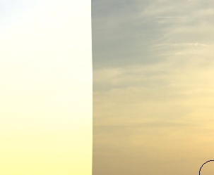
My primary blending focus will be the sky, as the colors in the sky of each picture seems to be very different. So in order to do this I'm currently using a very large brush size that is just over '400px'. I started clicking just to the edge of the separation rather than directly on it in order to make the connection more seamless (this is shown in the picture below).
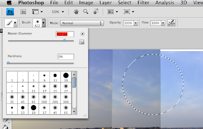 The round marquee tool represents the brush and where I would click to blend the layer together. (The part I'm blending here is the closest separation to the brush drop down list. Ignore the line that the brush is currently on).
Update 2 (29/09/09):
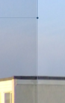
So far I haven't run into any hiccups in my first panorama and am nearly half way done. However, at this point, shown in the screenshot above, I have had to warp a small part of the pictures in order to be able to align since the hut as shown connects onto the same hut in the next picture.
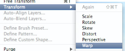
This shot is simply showing how to access 'warp' under 'edit then 'free transformation'. What warp allows me to do is change the distance between certain things in the image. However, pulling one part in a direction means that another part of the image will also follow. But it is possible to even it out by pulling on different lines in the warp grid.
Update 3 (02/10/09):

For the past couple of days I have been blending without having to warp (except for the hut as mentioned) but I have now reached the point in my pictures where the Sea is visible. Since my pictures are separate there is naturally no alignment with the horizon. But of course this is quite easily fixed with the 'Warp' tool as shown in the screenshot below.
As well as having to warp the Sea, I am now a t a point where as the pictures get closer to the sun they are vastly different in lighting. This can cause major problems when blending however, using a couple of techniques taught in class and one that I researched myself I am able to change the lighting effectively in order to make blending more seamless.
The first technique I did (this one I found out myself) was to directly match the color of one layer to another.
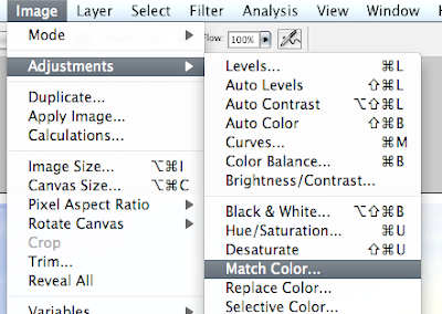
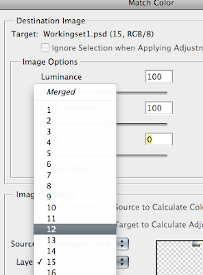
In order to match the color of a layer I selected the layer and then went to 'Image' - 'Adjustments' and then 'Match color'. Then a window appeared (the picture just above), which then allowed me to choose the layer who's color I wanted to copy. There are also a few things I change in this window such as the luminance and fade.

The next trick is altering the black and white levels (I learned this in class). To do this I clicked on a little icon on the bottom of the layers palette.
 A list then appears in which I choose 'Levels'. Doing this brings up a window that allows me to change the lighting - making it lighter or darker - and as a result blending is made easier.
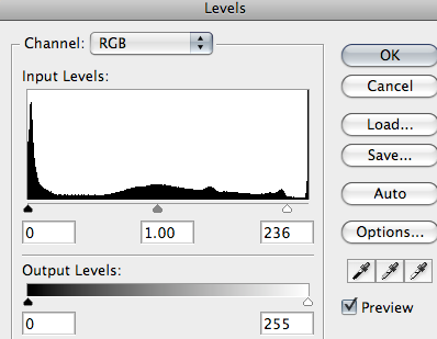
However, I have to be careful because if I decide to change the lighting when clicked on the layer itself rather than the mask, I am directly changing the original picture and this could result in loss of information. To avoid this I selected the mask, which again, allows for non-destructive editing.

0 Comments:
Post a Comment
Subscribe to Post Comments [Atom]
<< Home