Jim's Blog

Hello and welcome to my blog. This blog will be used primarily (or rather ONLY) for posting research and work I've done for I-media. So yeah...knock yourself out.

Thursday, October 22

Looking at Amp packaging and how this will effect my design.
Before I look into (and analyze) the packaging used for my Amp, I will look at logos of various brands and see what they have in common and how the logo I will make in Illustrator will also share similarities.


There are actually a lot more brands than this however, these are very well known ones and are good examples of how Guitar/Amp logos are closely linked. Again, as you can see, these are typography based logos and are also simple to read and recognizable.

I think the simplicity of the logos means that they are trying to appeal to a broad range of people but other than this I am having trouble seeing what other possibilities the designs could be linked too. It is however, entirely possible that the logos could be linked to the type of guitars/amps produced. For example 'Ibanez' produce guitars (as well as amps) that tend to lean further towards a 'Heavy Metal' sound and this can maybe be seen by the use of bold font in the logo.

But if you look at the 'Line 6' logo it is extremely different. It appears to be text upon a metallic rectangle shape, which to me gives of a feel of 'Rock' music. Now the main reason I think this logo is different is because 'Line 6' do not produce guitars and so their main selling point are amps. The other two produce both guitars and amps, however, they're primarily known for their guitars.

So by basing my logo of these conclusions I will hopefully produce a design that will be relevant yet simple (much like the designs above, my logo will be typography based).

Now that I have looked at logos I will look into packaging. Now as you can see the box echos the shape of an amp but I don't think that it's like for aesthetic reasons but rather because it's the only shape which will tightly fit around a cube.
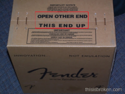

Below and above are pictures of amp boxes. The picture above was actually found somewhere on the Internet (it's difficult to find pictures of amp packaging) and the pictures below, as you can tell, were taken by me and are of my amp's packaging. By simply looking at both images there is quite some difference in appearance. The Fender amp is just a cardboard box with no design whatsoever except for the logo and some other text parts. Now if you look closely at the packaging used for my Line 6 amp you'll notice it's a lot more complex and actually has some colour.

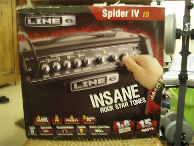
(These first two pictures are actually of the front and back of the amp box - both of which are identical in terms of design)
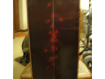


So as you can see I have taken pictures from all angles in order to get a good idea of the design seen on the box since this is what I will be basing my packaging design upon (I plan to use a similar structure but it will look different).

However, when coming to design my package I to be able to keep in mind what I am capable of in Illustrator. I mentioned that I will follow the same structure but I am unsure however, if I will be able to create something that (in my opinion) has the same level of creativity and depth as the box used for my amp. Like the first picture I will colour the box to avoid it looking simply like cardboard and will hopefully include an amp on the packaging to accompany the logo.

Labels:

Wednesday, October 21

My idea and why I have decided to do this.

I've decided to go with the idea of a amp box for a number of reasons.

Firstly, I have decided go with this idea because it's quite different to what other people are doing. I have also had numerous ideas for an amp box and have one here at home which I can base my design of, look at and analyze.

As mentioned before it's quite different as it's not a type of food (obviously) and thus does not contain lots of small text on the box but rather, it simply has a spider design along with the amp and logo (it has some quite complex designs with a lot of information on it). Note that any information on safety or guidance comes from a manual within the guitar box itself.

The design on amp boxes do vary, which is normal, but when I say 'vary' I mean some boxes seem to have very little design for example a card box with a logo while others (like mine) are a lot more complex.

Labels:

Looking at typography on packaging.

When looking at typography I decided to stick with the Kellogg's cereal since they have some great examples.

Firstly, the main image that comes up in one's head when thinking of Kellogg's is the logo, which is quite simply the name 'Kellogg's'. Now the reason why the logo is so strongly associated with the brand is because it's used all the time and is consistent as well as being simple in design, which is an effective attribute as mentioned in my previous post.


Here are three examples of Kellogg cereal boxes. As you can see on the first one despite the difference in background colour the logo remains red but is always placed on an area where it can be seen and read easily.

However, the text that does always change is the name of the cereal. If you look at it, it's clearly obvious that the cereal name is designed to suit it's target audience. So for example 'Coco Pops' is done in bubble letters and filled with a chocolate colour (this also appropriately represents the cereal), and naturally this would appeal more to kids rather than adults. Then there is 'Fruit 'n Fibre'. Here the text is a lot more simple, which makes it very easy to read and has something about it's design that seems more appropriate for an adult target audience; this is probably the white outline around the black text.

Here is a link that will take you to the entire cereal collection and you'll see that only one cereal box has 'Kellogg's' in a different colour (that is the corn flakes cereal).

http://www.kelloggs.co.uk/products/

Now for a quick look at another brand.


Here's another example where the logo is typography based. Again, this is a logo that is used and seen extremely often (too often if I might add) and is probably the most well known logo. It does sometimes appear in different colours , though white is the colour most used. As you can see this logo is easy to read and still maintains simplicity while also being stylish. It seems like this design was crafted in order to appeal to a very broad range of people, which seems to work as people of all ages drink it.

Logos product names aren't the only typography that can be found on products. When you look at the back of a product there could easily be all sorts of information such as competitions etc. But what you will always find are the ingredients and nutritional information unless it's not food then you'll find Health and Safety information etc.


These pictures here are from a cereal box for children ('Rice Crackles'). This particular cereal box actually does have a competition on the back and the nutritional information is located on the side. But if we look at the text you can see that the main attraction is the header in bubble letters in a pink on a yellow coloured background. To me it seems like the designer was trying to make it so kids would see this and then ask their parents to read it or enter the competition (whether they can understand the text, which is unlikely).

Finally, if we take a look at the nutritional information it is generally quite easy to read - I could do so even in a very dimly lit room - despite the small text. This seems to be due to the colour of the text - black on white, which is the biggest contrast you can get between colours. Then it's neatly arrange in to blue segments that represent tables and these tables contain all the various nutritional information.

One last point is that on any cereal box and most products it is important to make the name of a product to stand out more than anything else on the packaging because when someone is looking or shopping they usually think about the product itself rather than the brand (which I assume is usually thought of after the product). This is why when you look most packaging you'll notice the product name will be larger in font size than the rest.

Labels:

Tuesday, October 20

Researching package product design and graphic design.

Packaging design can be seen in numerous different ways for example protecting the contents of the package, a way of promoting the product and sharing information on it's attributes and benefits and of course packaging being a part of the product itself since it is usually designed around the product.

Up until recently, packaging was mostly crafted to be appealing and designed to add value to products. However, since global warming has become much more of a serious issue, packaging has changed. If you go to a supermarket now, you can see how many product packages have been designed to be 'greener' (some packaging even has this written on it - most likely to help gain the customers approval and support). This is also quite an important factor to include when designing my packaging (though it will most likely depend on what type of product I decide to design a package for).

But when looking at packaging being visually appealing, it must have simple icons that stand out wherever the consumer is looking (except, of course, if the consumer is looking in the opposite direction). These icons are known as 'Visual Equities'. From research I have learned about several ways that must be noted about when designing packaging in order to improve the visual equities of a product. These are:

Shape - Designing the packaging to echo the shape of the product for example Ipod boxes, Headphone boxes etc.

Colour -
This should also be used to be able to identify a brand. For example 'Xbox' white and green or the 'Coka-Cola' white and red. An unusual example would be crisps like Walkers since they use a variety of different colours for their packaging but the colours tie in with the flavours and this makes them all instantly recognizable, though the logo is yellow, which I assume comes from the yellow colour of crisps themselves.

Illustrations - For example the 'Nike' tick or 'Apple' logo.

Name - The use of a catchy name like 'I can't believe it's not butter'.

Of course, if a products packaging does manage to nail all of these points well, there is still the issue of product information. So if a certain packaging does manage to attract attention, the text has to be easy to read and digest. The designer also needs to consider the order of secondary information (foodstuff ingredients etc.) because getting this hierarchy right is very important for achieving user-friendly packaging.

If you look at the colours used for the background, yellow, darker yellows and brown, they do seem to be fairly similar to the cereal, which is actually pictured on the box. Of course there are other colours as well such as red and black but these have been used for the foreground text (brand logo and cereal name).

As a colour test, in Photoshop I took a selection from the cereal using the Marquee tool and pasted this into a new document. I then added a 'Mosaic' filter and enlarged the cell sizes to make the colours a lot more clear. Note that this is a method I learned in class for creating colours that almost always compliment the design of a product. This is the result:

The colours that are shown here are certainly not very different from the ones used in the background of this cereal box. Even if none are exactly the same (though they certainly appear very close), it seems highly likely that the designer took the colours from the cereal either using this method or a similar one.


Labels:

Monday, October 19

Commencing a new project in Adobe Illustrator - 'Packaging Yourself'

For this project I will be producing packaging for a box, which could be anything from Cereal Boxes to laptop boxes etc. The design must be made up entirely of Vector creations made in Adobe Illustrator, while using our own name instead of a real brand name on the box.

This project will follow similar structure to the previous one however, this time I will be using a sketchbook to place various packaging in for analysis. The research amongst other things will be posted onto the blog.


Labels:

Monday, October 5

Reflecting upon my work and things I'd change.

So after completing my work, which includes the blog - research, ideas, and log - and also the products (three panoramas), I decided to look back over it and comment on things such as mistakes, improvements and what I would have done differently if given the chance.

So firstly, I am very pleased with how my research went. I covered various things (and hopefully what was required after reading the brief) such as Panoramas, QTVRs and Photographers as well as some history of the subject. I also think my choice of theme was good, using a low point for my first panorama and so on.

However, my main problem which lets down my work is the lighting. I decided to take the images in the evening (a very, very bad idea if I may add and I HIGHLY recommend not doing this for future projects similar to this). I originally thought having a nice setting would add some form of atmosphere, which is of course now ruined due to the lighting differences.

The pictures with the sun in them seemed to be very dark, again due to the sun rendering everything else a lot darker. So when blending, the difference in lighting was quite easily noticeable and this is called 'banding'. Of course there are many techniques possible to change the lighting, though not all of them worked and changing the lighting too much makes the images seem very unnatural (in terms of lighting anyway).

But you must also note it could be a number of problems to why I had these issues. For example I was using a fairly shoddy Tripod and the camera may have a few problems when directly aimed at the sun. But thinking back to my pictures I now realize I should have not started taking the pictures while facing the sun. It means I have two ends with the sun in it (start and finish) and as a result two areas with lighting problems rather than the possible one area.

But in having these problems I learned a lot about altering lighting in images as well as being precise and accurate while paying attention to small details. There were also various other methods of changing lighting, which I learned from friends and research other than doing it manually but this would be cheating and really I never cheat (this may sound somewhat sarcastic but I assure you it's not meant to be!).

So overall, I am pleased with the methods I learned and used. But if given the chance or even if we were given a later deadline I would have taken my pictures again when the sun isn't so low in the sky.

Connecting the ends and making the QTVR.

Now that everything in my panoramas has been blended I need to connect the ends so that when I place my image into 'Stitcher' - a software used to make the QTVR - it would be seamless as you looked through my panoramas.

So firstly, in Photoshop, I flattened my PSD and re-saved it so that I have a copy to fall back on.


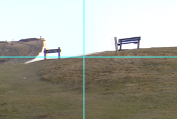
So now that my image is flattened I now need to pick a place in the image where two points meet perfectly and seamlessly. So if we take a look at the screenshot below, I have highlighted the point I'm going to choose.

Now using the marquee tool I will select one side of the image up until this point and hit 'Apple J'. This copies my selection onto a new layer.

Now while maintaining this selection I hit 'Apple - Shift - I', which then inverses the selection. Again, I hit 'Apple J'. I have now ended up with to parts of my panorama on two new layers as shown in the screenshot below.

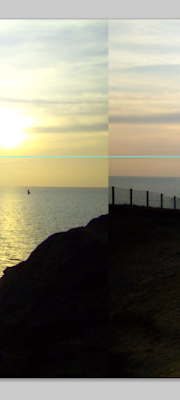
I now switch the images to the other sides 'Layer 2' from right to left and 'Layer 1' from left to right. I now the two previous ends I had need to be joined up together and it looks like this:

As yo can see in order to get those seamlessly blended together (seamlessly - to a certain extent since I had a lot of trouble). Then after doing so I flatten the image again and save it as a 'JPEG'.

The next part of the process is to make the QTVR in 'Stitcher'. Now Stitcher is a very easy piece of software to use albeit quite a buggy piece software since it closes down unexpectedly (though it's not really unexpected after a while) after each QTVR made.


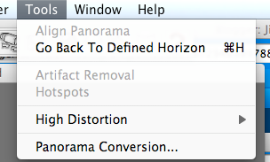
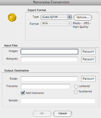
So first of all I went to 'Tools' then as you can see 'Panorama Conversion...'. What this does is brings up a new window, shown below, that lets you name your file, select the output format and output location of the file. Note that it says 'Cubic QTVR' but when clicking on the drop down list I chose 'Cylindrical QTVR'.


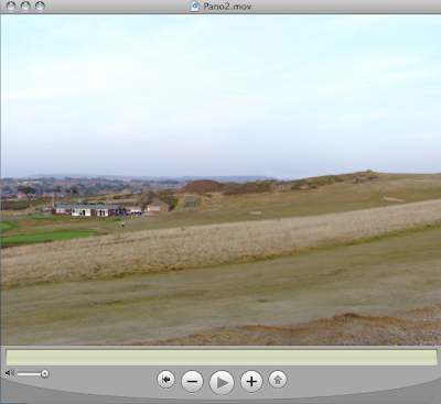
After finishing the output and expecting the unexpected 'Force Quit', I opened up my QTVR and it looks like this. I have now given it a couple of whirls and it all seems to be quite seamless apart from the banding that was mentioned in a previous post.

Decisions and proccess of panorama 3.

Update (05/10/09):

This is the third Panorama before I start to edit on it.

So the first thing I noticed upon putting these images together is that although there is some change from dark skies and grounds to lighter skies and grounds it is not quite as drastic as the previous two Panoramas I have done and as I blend grass and other parts, they don't seem to blur quite as drastically as my previous works.

However, although I am having trouble blending the darker areas. Like the previous pictures as I move away from the sun I don't seems to have any issues at all.

As you can see the sky and grass seems to blend in quite well.


Sunday, October 4

Decisions and Process of Panorama 2.

Update 1 (03/10/09):


(Ignore black marks)

Panorama 2 is at the middle of Seaford Head and like the first one I am having issues with the lighting, except the issues I have with this particular Panorama are a lot more difficult to solve due to the abrupt change from bright to dark where the sun is.

As I go through this Panorama blending, I am using the same techniques as I did with the previous one. The only slight difference is that when selecting the 'Levels' layer (which is of course linked to a image layer) I hit 'alt' and 'backspace' at the same time.

Doing this turns the 'Levels' layer mask into black. This allows me to to lighten certain parts by going over them with a white brush.

However, even with these various techniques I have used I still find it difficult to make the lighting perfect on this particular panorama and I have also noticed that changing the lighting too much can make the lighting appear very unnatural.

It is also much easier to blend the sky than the ground or the grass because when I blend the sky I don't get any blurring issues.


This is an example of blending I have done with the sky. If you look from left to right you can see that it goes from darker to light. However, there are no obvious issues as it blends quite seamlessly.

This is an example of me blending the grass quite well but as a result am getting a slight blur. Of course in order to fix this I will have to play with the lighting and the brushes until it's a lot less visible. Note that this blur is only really more noticeable when zoomed in like this screenshot here and is a lot less noticeable at normal zoom.


Thursday, October 1

Decisions and Process of Panorama 1.

This particular post will cover all my processes and decisions for my first Panorama. Note that everything will be written in the one post rather than always making new posts (especially if they are minor changes).

Update 1 (28/09/09):


I have taken my pictures and have placed them together one behind the other, the first image of the panorama, as you can see is on the left because it is the direction in which these shots were taken.

The very first thing I did (I'll be doing this for all my panoramas) is to reduce the image size of all my pictures - from the original size, which was nearly 2000 pixels to about 1000 pixels. As a result Photoshop runs quicker and without any hiccups or crashes.

My main technique for blending the images together so they appear to flow will be by masking each individual layer - this allows for non-destructive editing - and using a black or white brush to either make it invisible (black brush) or to repair and make visible (white brush).

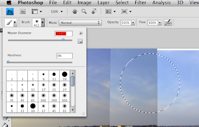
My primary blending focus will be the sky, as the colors in the sky of each picture seems to be very different. So in order to do this I'm currently using a very large brush size that is just over '400px'. I started clicking just to the edge of the separation rather than directly on it in order to make the connection more seamless (this is shown in the picture below).

The round marquee tool represents the brush and where I would click to blend the layer together. (The part I'm blending here is the closest separation to the brush drop down list. Ignore the line that the brush is currently on).


Update 2 (29/09/09):


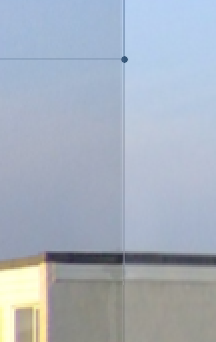
So far I haven't run into any hiccups in my first panorama and am nearly half way done. However, at this point, shown in the screenshot above, I have had to warp a small part of the pictures in order to be able to align since the hut as shown connects onto the same hut in the next picture.

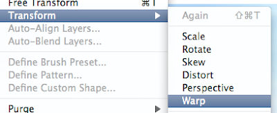
This shot is simply showing how to access 'warp' under 'edit then 'free transformation'. What warp allows me to do is change the distance between certain things in the image. However, pulling one part in a direction means that another part of the image will also follow. But it is possible to even it out by pulling on different lines in the warp grid.


Update 3 (02/10/09):


For the past couple of days I have been blending without having to warp (except for the hut as mentioned) but I have now reached the point in my pictures where the Sea is visible. Since my pictures are separate there is naturally no alignment with the horizon. But of course this is quite easily fixed with the 'Warp' tool as shown in the screenshot below.


As well as having to warp the Sea, I am now a t a point where as the pictures get closer to the sun they are vastly different in lighting. This can cause major problems when blending however, using a couple of techniques taught in class and one that I researched myself I am able to change the lighting effectively in order to make blending more seamless.

The first technique I did (this one I found out myself) was to directly match the color of one layer to another.


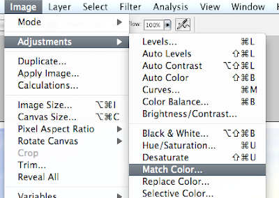
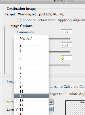
In order to match the color of a layer I selected the layer and then went to 'Image' - 'Adjustments' and then 'Match color'. Then a window appeared (the picture just above), which then allowed me to choose the layer who's color I wanted to copy. There are also a few things I change in this window such as the luminance and fade.


The next trick is altering the black and white levels (I learned this in class). To do this I clicked on a little icon on the bottom of the layers palette.

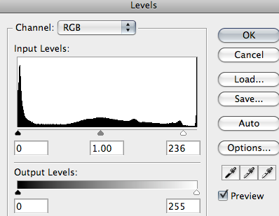
A list then appears in which I choose 'Levels'. Doing this brings up a window that allows me to change the lighting - making it lighter or darker - and as a result blending is made easier.


However, I have to be careful because if I decide to change the lighting when clicked on the layer itself rather than the mask, I am directly changing the original picture and this could result in loss of information. To avoid this I selected the mask, which again, allows for non-destructive editing.

Starting my project and choosing my theme.

This post will cover the decisions I have made with themes and where I'm going to take my shots. You might notice from the pictures that I have decided to go with the theme of 'Seaford Head'.

One of the main reasons to why I have done this is because it is possible to get some nice views of Seaford and also the Seven Sisters (I also live only a few minutes away which helps A LOT).

Of course I have to do at least three Panoramas and in order to get some variation within my Panoramas I have decided to do a low point, mid point and a high point so it will be as follows:

Panorama 1: Low point - at the bottom of Seaford Head.


Panorama 2: Mid point - further up the cliff - there is now a clear view of Seaford.


Panorama 3: High point - at the very top where you can see Seven Sisters as well the majority of Seaford as you go round.


These pictures are just to show the difference between each point and as you can see from these three there is certainly some variation in what can be seen at the different points (it should be more noticeable once the panoramas are complete).

Finally, I picked a certain time in the day to take my pictures which if you can see is the evening. I picked this time of the day because I personally think the colour of the sky makes the images more interesting and atmospheric - by adding more colors that blend in with the blue sky (such as orange, red and yellow which are the most noticeable ones).